Product Designer, Founding Team Challenge - 2026
Aurora Interface
Aurora's founding product designer brief asked for an "inspiration page," with no further definition, forty-eight hours, and a live product already shipping under the copy. I built the discovery feed I believed that page actually needed to be, a working prototype with real state, not a moodboard.
Role
Product Designer - end-to-end UI/UX and interactive prototyping
Tools
Figma
Figma Variables
Auto Layout
Component Sets
Dev Mode
Interaction Design

11
inspiration cards wired with live signal states
64
hover interactions prototyped across the calendar
Ethos - 01
What does taste look like as an interface?
The brief named "inspirational content" as one of Aurora's real content types, alongside travel, health and logistics, which read less like a moodboard request and more like a request for the surface that sits in front of the concierge, a curated, AI-personalised feed a member browses before a request becomes a booking. I emailed to confirm the interpretation. When the reply did not come inside the window, I built on my best judgement rather than wait past the deadline; a founding designer's first decision under an open brief is what to do with the parts nobody defined.
My first pass borrowed the italic serif and warm palette from my own portfolio, which was a mistake I caught before shipping it. Aurora runs on one typeface, one accent colour and a near-black ground, with no second hue anywhere in the system. I pulled the real tokens from the live site's own CSS rather than reinterpreting them, then rebuilt the feed inside that restraint; a single accent used well says more about premium positioning than three colours used cautiously.
Taste is not a moodboard. It is a system disciplined enough to keep making the same good call without you.
Interactive Figma Prototype


Photos


Process - 02
Audit, wire, refine
What I built, in the order the brief forced it, and where each stage changed the next.
01
Read the brand before designing for it
I pulled Aurora's real design tokens from the live site's CSS rather than trust memory or reuse my own system: one typeface, one near-black ground, one orange accent with its own alpha-tint scale for glow and emphasis. From Aurora's own language I built a content taxonomy of five short editorial nouns (Stay, Table, Access, Restore, Gift) rather than a conventional menu bar, and settled on a single ranked feed over category tabs, since the brief's own copy treats "inspiration" as one continuous stream a member scrolls, not a set of departments they choose between.

02
Wire the signal system
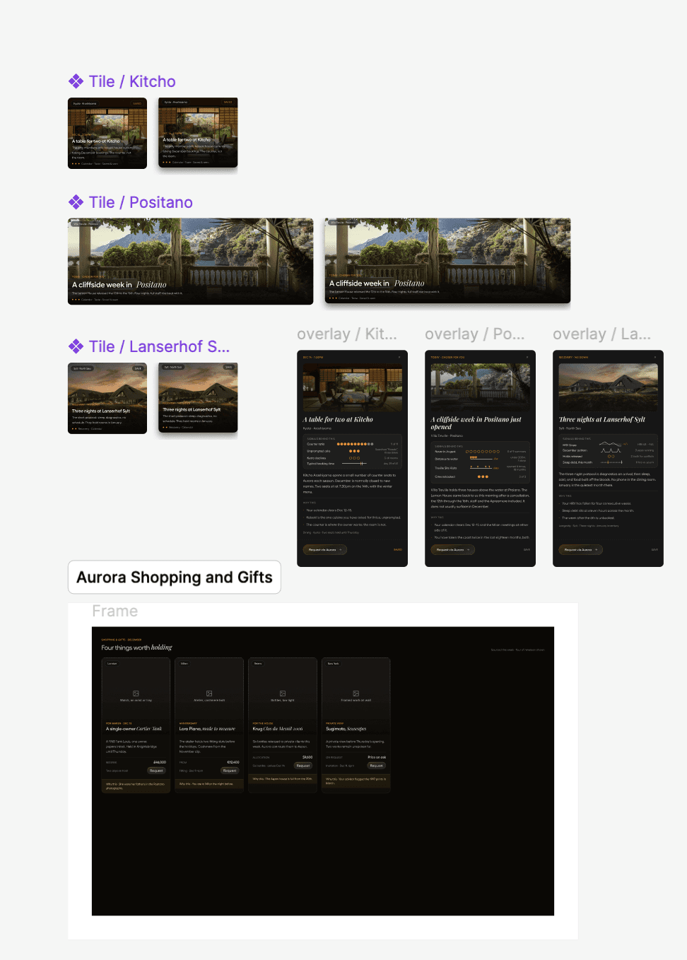
A six-card sidebar (Calendar, Recovery, Location, Taste, Saved & seen, Family & friends) drives the feed through 28 live Figma variables. Hovering a signal rings its matching tiles and dims the rest, so the logic behind each recommendation is visible before a member ever asks for it. Three flagship placements (Positano, Kitcho, Lanserhof Sylt) got full componentised hover states, eased with Smart Animate, plus a detail drawer that opens from the right with real copy rather than lorem ipsum; the other eight tiles stayed plain by design, so the file could carry depth where it mattered instead of spreading it thin.
03
Add memory: filters, reasoning, states
A calendar strip filters the grid to a real date window, hiding the tiles outside it and reflowing the rest rather than leaving gaps, with a chip and a clear control so the filtered state is always visible and always reversible. A toggleable "why this" reasoning layer surfaces the AI's actual logic on all eleven cards and the gifting rail, on request rather than by default, since a concierge that explains itself constantly reads as needy rather than trustworthy. A nine-state hover system on the calendar's own detail card, with the booking action moved inline rather than left as a separate footer, closes the loop between browsing and acting.
What I made - 03
A working prototype, not a moodboard
+
Brand and content-system audit
Six-signal sidebar with 28 live variables
Componentised hover and detail-drawer states
Calendar-driven filtering and reflow
Toggleable reasoning layer across 11 cards
+
Brand and content-system audit
Stack
Figma · Figma Variables · Auto Layout · Component Sets · Dev Mode
Findings - 04
An unanswered brief is not a blocker. It is the first design decision a founding designer actually has to make.
3
of 11 cards built as fully interactive components
28
live variables driving hover, ring and dim states
0
colours borrowed from my own portfolio system
Learning - 05
Ambiguity is a brief, not an excuse
Waiting on a reply that never came would have cost the deadline, not just a day. Committing to a defensible reading of the brief, in writing, in the submission itself, is what a founding role is actually asking a candidate to prove they can do.
Constraint reads as taste
The version that looked most like a moodboard was the one built from my own palette. The version that looked like a real product was the one disciplined down to Aurora's single accent and one typeface. Restraint, verified against the source rather than invented, is what premium actually looks like on screen.
Next case study
Magneto haptic prototyping
Harriet Fisher
Made with love.